Friday, 13 November 2015

Week 08 - Life Drawing

The last couple of weeks we didn't have life drawing. This week was also only a short session as we had a lecture in the morning.

The model we had this week, we had actually had before so it felt familiar and easier to draw her body. We drew four 3 minute poses to start with.

Next we were told to pick one medium other than charcoal. We started to draw the model with one of the medium we chose. I knew we would be going over with the charcoal after and seeing as biro doesn't work well over charcoal I chose the red pen first. Then we went over in charcoal but using our other hand. I always find this difficult as I barely have any control so I used the side of the charcoal to shade instead of add detail.

Then we went back over with the biro. I added extra detail and made the edges more visible. I ended up having the biro in my right hand and charcoal in my left and alternating which one I used when needed. The charcoal is messy but I feel it looks better than if I had used the biro in my left hand.


Next we were told to enlarge the body and focus on just one part. I thought that meant one feature so I worked on drawing the hand. Hands are something most people struggle with so I was being quite brave to try it. I sketched most of the surrounding body before focusing on the hand.


I found drawing hands much easier when you have something to draw from. Although I wasted all that time by focusing on such a small feature, I am really happy with how it came out.

Lastly we did one 5 minute pose. Knowing we didn't have long, I blocked it out very roughly but I think that captures the shape of the body well.

Tuesday, 10 November 2015

Week 08 - Zombie Model

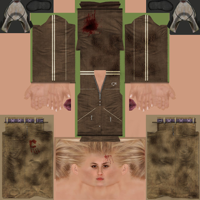
Last lesson we looked at a Maya model of a zombie.


The zombie movement was already made as well as this diffuse. Obviously this doesn't look much like a realistic zombie so using the Photoshop file which had all the layers separate we edited them to make our own zombie.


We were asked to change the colour of the jacket, change the face, make a different logo and add blood and other bits to make it look more like a zombie should. I used different layers and experimented with layer styles to make the dirt and blood look more realistic.

This is what the final textured model looked like. I realized the face looked a bit thin and the handprint had stretched but otherwise I like how it looks.


Sunday, 8 November 2015

Week 07 - Sci-Fi Enviroment

After the session on perspective, we were given the assignment to create our own sci-fi room using two-point perspective.

I had a rough idea of the style of room I wanted so I searched for rooms with lots of panels and pipes.


I used the perspective lines to first make the room shape. I made it a bit more difficult for myself by adding a corner so there are three visible walls instead of two. 


Saturday, 7 November 2015

Week 06 - Tentacle Creature Assignment

This week's assignment was to design a creature with tentacles.

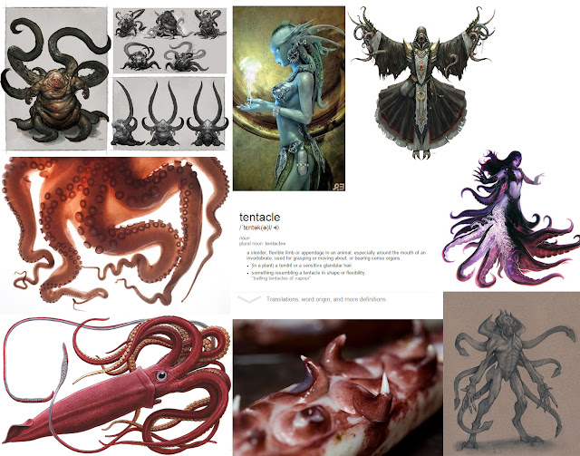
I began, as usual, by doing some research. I looked for interesting designs and pictures that might help me. There was a huge range of different tentacle creatures and was having a hard time finding just one type to stick with. I searched for the meaning of tentacles so that I knew what really classified and would be considered as tentacles so I knew what I was limited to.

I actually had a lot of trouble trying to come up with a design that I liked. I first tried the technique we learned for the crustacean creatures and start with silhouettes but as you can see above, I could not manage anything and kept giving up after a few tentacles.

I thought that sketching traditionally would be easier as that is what I'm more comfortable with but that actually turned out even worse.

I then remembered an art programme I had used before called Paint Tool SAI. It is not a professional programme but as I was having trouble making a rough, sleek silhouette with the hard brush in Photoshop I thought it was worth a shot. I opened a blank canvas and began with some sleek, smooth marks. The flow of SAI brushes made a huge difference and as you can see in the first image, I managed to think of a design.
I next went in to adding the detail in grey scale as I had done with the crustaceans. I then  added a layer of simple colours.

I don't really know how to do backgrounds so using a splatter brush to mimic water and an ocean texture set on a multiply layer, I added a block background.
I am relitively happy with my final design and feel I am finally getting the hang of painting digitally though I would like to learn how to add a simple yet effective background to my designs.

Monday, 2 November 2015

Week 06 - Perspective on Photoshop

In the last visual design lesson we looked perspective in Photoshop.

We were given a selection of pictures to look at the perspective of. We used the ruler to drag down a horizon line. We then used the pen tool to create a line from where we guessed the vanishing point was. We continued to copy and paste these lines and manipulated the ends to meet the edges in the picture as well as moving the horizon and vanishing point to make it as accurate as possible.


We then tried a picture with two point perspective. This was slightly different as even if the horizon line was at the same angle, the two vanishing points were out of the picture in different distances.

Lastly we tried a much wider picture with very stretched vanishing points. This one took a lot of getting used to as the slightest movement made a huge difference.
These activities were very useful for me as I don't draw architecture often and perspective is very important when doing so.


Week 05 - Lava Creatures

During this lesson we looked at lava. We were taught a few different ways lava can be painted.

This is the sample I made during the lesson using the pen pressure brush and yellow, orange and red to create the lava glow.

I created a mindmap of other lava creature designs.  I had the idea of a lava snake in mind as I thought the scales would be perfect as the bits of stone between lava.


First I painted the basic shape of the snake I wanted. I then went over drawing the scales. Using another of the techniques we learned during the lesson (layer effects in Photoshop) I went over the gaps between the scales and tried to make them look as much as lava as possible, including the lava dripping from the mouth. I added more cracks under the snake to look like a volcano floor.
Lastly I added a soft texture to the glowing lava and one to the floor.

Sunday, 1 November 2015

Week 06 - Life Drawing

We began with five 3 minute drawings as usual. I was feeling quite rusty for some reason so I don't really like how these came out as I just couldn't seem to get the drawings right.


I also noticed that I was slouching a bit so even if this was my favourite drawing of the five, it was slightly wonky and leaning to the left.


Next was my least favourite part. We had to use two different medias, one in each hand, and draw the same thing on each side of the paper with both hands at the same time. This was so incredibly difficult and just couldn't focus.


As you can see, as I couldn't focus on either fully, it meant they both went terribly. The left one ended up being stretched sideways while the right one stretched vertically.


We then tried again, switching the media. It was slightly easier the second time but I still found it virtually impossible to do.


Once again they were stretched in opposite directions. I also pressed way too lightly with my left hand so you can't see the pen marks very well.


Next we got 30 minutes to draw a pose. The aim was to be as accurate as possible and as we had so much time, we didn't have to rush. Though I didn't finish it I think I did well making it accurate as I spent the time insuring what I was doing was good instead of just getting it done.


I used a 2H  pencil to sketch out the basic shape and then went in to more details with softer pencils to make darker marks. I started by drawing a line down the back so that I could follow the flow and direction, which the model complemented me on later.


Next our focus was on the lighting and shading. I found it hard to get this one to look good as this time I was not focused on the accuracy of the shape which I am quite annoyed about.


At first I didn't know how to add the shading without making a hard outline but I shaded the background a bit to add contrast.
I took a long time on these poses and spent longer than others meaning I did less work I am happy with the way they were going.


Monday, 26 October 2015

Week 06 - Mushrooms

In today's lesson we started learning how to make mushrooms. As a lot of people were having trouble with this, we didn't get round to finishing it so I decided to finish mine at home. I made a simple brown mushroom with a rough texture.


 I still had the file I was painting on open in Photoshop so I decided to carry on painting a few different mushrooms too in brighter colours  as I wanted them to look more magical then realistic while still looking believable. I saved each of these different textures as different files and assigned them to some duplicated mushroom. I rotated and stretched them all to make them look more like a real bunch of mushrooms.

I noticed that the stems of the mushrooms all have a line going through them. I had painted it all correctly and evenly as possible so that would be just where the UV map joined back together but I wasn't sure how to fix this.
I really liked making these and will probably continue as I may be able to fit them into my walking simulator.

Friday, 16 October 2015

Week 05 - Life Drawing

We started off this life drawing lesson with five 3 minute poses.


We then did the walking activity again where the model walks around and we sketch out some of the movements. I drew more poses this time though most are not complete.

Next was one of my favourite activities. We blacked out our paper with the side of the charcoal. Instead of using the charcoal to draw, this time we used a rubber to the opposite and build up the light for a 15 minute pose. I didn't have a soft enough piece of charcoal to make the page black enough to make the contrast more obvious but I really liked the way this one came out.


I used the edge of the rubber for the larger areas, that's why it looks like square brushstrokes. It's very messy but I feel with more practice I could have made it much better.


We then tried another pose but this time I accidently used some compressed charcoal which meant it was very dark, which I preferred, but because the charcoal was so thick it was very difficult to rub out. This is why this one looks more rough as I had less control over how much to remove.


We then chose two different medias for two 10 minute poses. I enjoyed using the red biro but I didn't get the shape of the legs right. I found the ink easier, especially for the shading as I could just block on some watered down ink whereas you can't make large strokes with a biro.

 While looking at this set of drawings I noticed that I tend to stop at the thighs and don't often do the legs. Next session I might try starting with the legs instead.