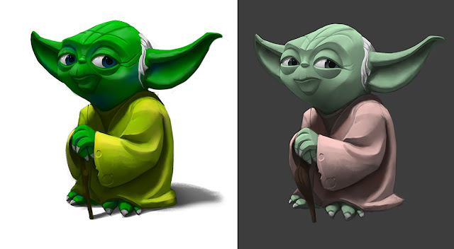
This week we watched a video on colour theory. I feel more comfortable working in black and white so this was important for me.
The image on the left used highly saturated colours, close to each other on the colour wheel while the right one has complementary colours, opposites on the colour wheel. I like the one on the right more but I like the mixture of the yellow and the green cloth on the left.


No comments:
Post a Comment