Friday, 27 November 2015

Week 10 - Anthropomorphic Character/Creature Design

This week's assignment was to design an anthropomorphic character. We have done some character designs before but anthropomorphic designs are different as the way you incorporate an animals features must be more realistic but subtle.

I kind of already had an idea of the sort of character I wanted to design. I wanted to make some sort of  seller/trader amphibian character so I sketched some looks on paper to start off with.

I then went and made a quick mindmap of frogs, there colours and features to help make my character more realistic.

In the lesson I began sketching the face and basic body shape, skinny with long legs. I added some block colour. I saw how most frogs have patches and wanted to add vitiligo to the skin as a more human version of the dark skin.

I tried to fully paint the concept but couldn't get the right textures on the skin.

I couldn't quite get the right depth in the painted version so I put the sketch layer on top. I much prefer how this looks. It has all the details that just the paint doesn't have.
I am happy with how the character looks, I think it has a good balance of both human and frog features while still having enough character to hold up. I would like to add more details to the clothes or more wares attached to the backpack which is more like the character I first imagined as well as I would like a slimier texture to the skin.

Friday, 20 November 2015

Week 09 - Adding materials

As I was looking around in my walking simulator, I noticed that the size of the character in comparison to the objects in the room made it very difficult to tell what things were. As a normal sized character things are more obvious as you can see the whole object, even if it is just a greybox whereas when you are small and on the floor, everything just looks the same.


I decided to download some free material packs from the asset store. We aren't supposed to texture as it would take too long but I felt I needed at least some basic materials in my game. You can't select faces in Unity so when you add a material, it adds it to the whole object. Because of this I went back into Maya and separated some faces from objects such as the floor and part of the lights.

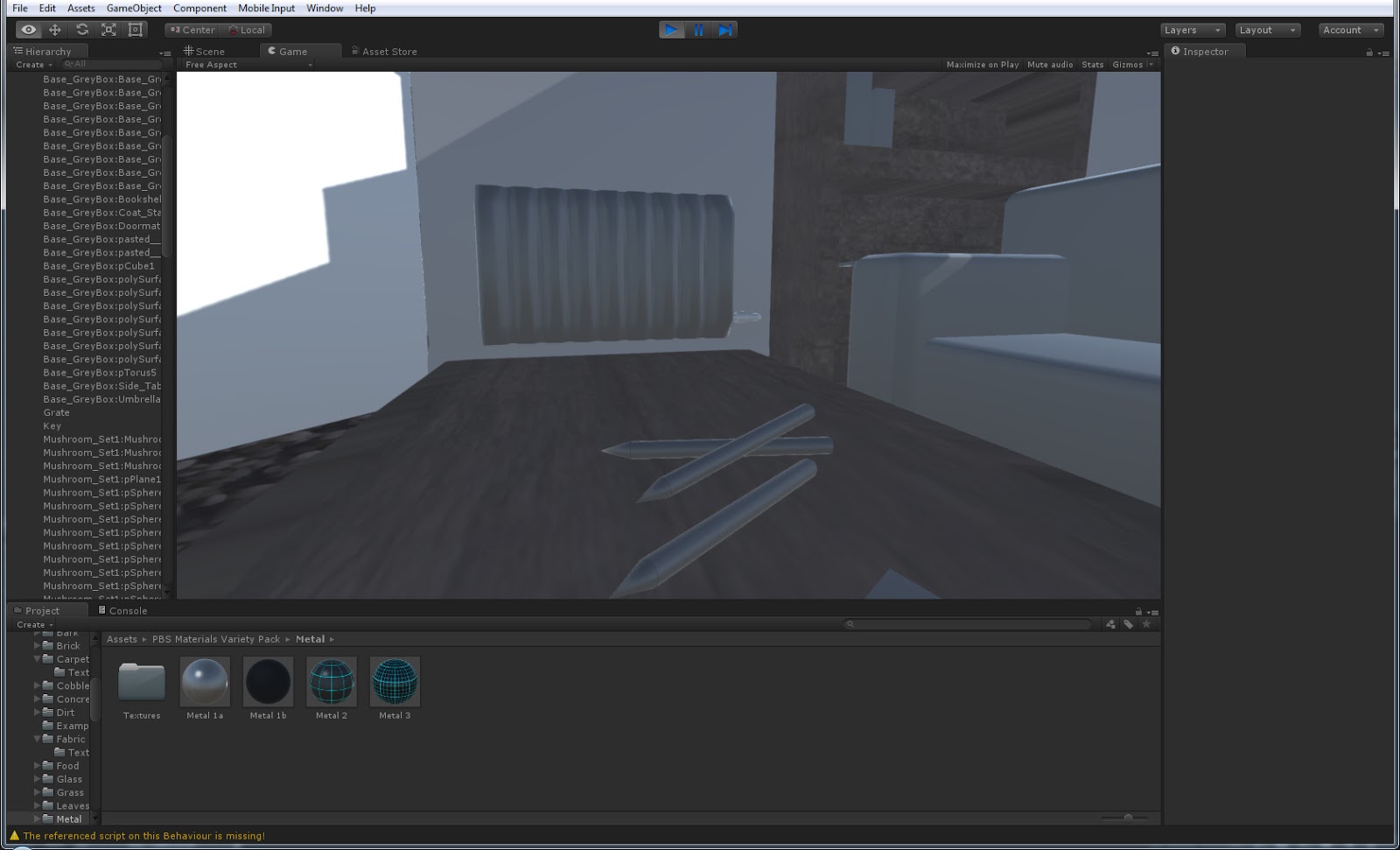
In this screenshot you can see that I used a glass texture for the window. I needed this to bring some light into the room as even with lights it was too dark. Unity has a pre installed glass effect which I had previously tried using. It made the object see through but it was completely invisible and did not look like glass at all so I decided to use the one from the pack which looks like it has a rough glass texture.

I added a metal material to the key as before it completely blended into the book underneath and most people who tested the game completely walked past it. One problem I found is that the materials stretched on each face causing strange patterns like what happened here. I also had the same problem when adding a material to the sofas. I don't think this will be too much of a problem as it is only supposed to be a greybox in the first place.

Thursday, 19 November 2015

Week 09 - Life Drawing

First off we did five 3 minute  poses. I arrived a little late so didn't have time to start the first one.

We looked at perspective in this session. There were some pieces of paper on the floor around the model which we could use to help find the horizon line and vanishing point. Unfortunately I didn't use these and went straight in to drawing the figure with just a basic idea of where the horizon line was. I added the paper after but found it much much harder this way round.

In the next pose I very lightly sketched the paper on the floor (though you can't see it clearly in this photo). Using pencils made it much neater and more accurate, though this also means it takes more time to draw.

In this picture you can see the lines better. I'm actually quite with this as it is very accurate. My usual problem is placing the feet and proportions as I can't always tell where I should be drawing parts.

Next we drew around the figures and added the detail to the rest of the room. This was a lot of fun and a good way to quickly understand perspective.

Lastly we were allowed to do whatever we wanted. As I hadn't used a felt tip before but had seen others use it, I decided to have a go.

I wasn't feeling very good and couldn't bring myself to add much detail as I usually do so this was a great way to very roughly draw the body.

Tuesday, 17 November 2015

Week 09 - Value, Form and Lighting - Armored Tank

During this week's lesson we watched a video on lighting.

We were given a blank image of these boxes where we used what we learned from the video to colour them in. This was really useful as I'd never learned these rules before.

Our assignment was to create an armored tank to show what we learned. I created a mindmap of some tanks to help with my design as I'm not good at machinery.

Using features from different tanks in the mindmap I made a sketch of a tank.
 Next I made the lineart. As I made most of the lines straight, I held down shift on Photoshop to ensure a neat image.
 I used fill to colour each section as the lineart was already neat enough to use.
 Without the black lines it is easier to see the form of the tank.I made lots of slanted and odd ledges so it was difficult to work out what shade each part needed.
Although I didn't fully paint it this was good practice as I had to keep in mind which direction the light was coming from and work it out as I went along.

Week 09 - Axe Prop

Today I decided to work on some of my props for my battle arena.

 I started sketching an axe and a sword, as I had included weapons in my mindmap. I knew I wanted some sort of Celtic design/pattern on it so I tried some out. Next I made a quick model in Maya. I left it relatively simple to keep the triangle count as low as possible as most of the detail could just be added on with a texture.


 I rendered the model in Maya and saved the picture. I then opened it in Photoshop, copied it twice and edited the levels to make it clearer to see.


I wanted to think about what sort of designs I could use without having to sketch it out each time or texture it and found painting over the model in Photoshop to be very quick and helpful. I thought of what both a wood and metal axe would look or leather parts on the metal. I like how all of these look though I feel I could add more Celtic style patterns in the metal to make them all look like they are part of the same scene.
I will definitely use this again, probably for sketching the patterns on the fountain or column.

Friday, 13 November 2015

Week 08 - Life Drawing

The last couple of weeks we didn't have life drawing. This week was also only a short session as we had a lecture in the morning.

The model we had this week, we had actually had before so it felt familiar and easier to draw her body. We drew four 3 minute poses to start with.

Next we were told to pick one medium other than charcoal. We started to draw the model with one of the medium we chose. I knew we would be going over with the charcoal after and seeing as biro doesn't work well over charcoal I chose the red pen first. Then we went over in charcoal but using our other hand. I always find this difficult as I barely have any control so I used the side of the charcoal to shade instead of add detail.

Then we went back over with the biro. I added extra detail and made the edges more visible. I ended up having the biro in my right hand and charcoal in my left and alternating which one I used when needed. The charcoal is messy but I feel it looks better than if I had used the biro in my left hand.


Next we were told to enlarge the body and focus on just one part. I thought that meant one feature so I worked on drawing the hand. Hands are something most people struggle with so I was being quite brave to try it. I sketched most of the surrounding body before focusing on the hand.


I found drawing hands much easier when you have something to draw from. Although I wasted all that time by focusing on such a small feature, I am really happy with how it came out.

Lastly we did one 5 minute pose. Knowing we didn't have long, I blocked it out very roughly but I think that captures the shape of the body well.

Tuesday, 10 November 2015

Week 08 - Zombie Model

Last lesson we looked at a Maya model of a zombie.


The zombie movement was already made as well as this diffuse. Obviously this doesn't look much like a realistic zombie so using the Photoshop file which had all the layers separate we edited them to make our own zombie.


We were asked to change the colour of the jacket, change the face, make a different logo and add blood and other bits to make it look more like a zombie should. I used different layers and experimented with layer styles to make the dirt and blood look more realistic.

This is what the final textured model looked like. I realized the face looked a bit thin and the handprint had stretched but otherwise I like how it looks.


Sunday, 8 November 2015

Week 07 - Sci-Fi Enviroment

After the session on perspective, we were given the assignment to create our own sci-fi room using two-point perspective.

I had a rough idea of the style of room I wanted so I searched for rooms with lots of panels and pipes.


I used the perspective lines to first make the room shape. I made it a bit more difficult for myself by adding a corner so there are three visible walls instead of two. 


Saturday, 7 November 2015

Week 06 - Tentacle Creature Assignment

This week's assignment was to design a creature with tentacles.

I began, as usual, by doing some research. I looked for interesting designs and pictures that might help me. There was a huge range of different tentacle creatures and was having a hard time finding just one type to stick with. I searched for the meaning of tentacles so that I knew what really classified and would be considered as tentacles so I knew what I was limited to.

I actually had a lot of trouble trying to come up with a design that I liked. I first tried the technique we learned for the crustacean creatures and start with silhouettes but as you can see above, I could not manage anything and kept giving up after a few tentacles.

I thought that sketching traditionally would be easier as that is what I'm more comfortable with but that actually turned out even worse.

I then remembered an art programme I had used before called Paint Tool SAI. It is not a professional programme but as I was having trouble making a rough, sleek silhouette with the hard brush in Photoshop I thought it was worth a shot. I opened a blank canvas and began with some sleek, smooth marks. The flow of SAI brushes made a huge difference and as you can see in the first image, I managed to think of a design.
I next went in to adding the detail in grey scale as I had done with the crustaceans. I then  added a layer of simple colours.

I don't really know how to do backgrounds so using a splatter brush to mimic water and an ocean texture set on a multiply layer, I added a block background.
I am relitively happy with my final design and feel I am finally getting the hang of painting digitally though I would like to learn how to add a simple yet effective background to my designs.

Monday, 2 November 2015

Week 06 - Perspective on Photoshop

In the last visual design lesson we looked perspective in Photoshop.

We were given a selection of pictures to look at the perspective of. We used the ruler to drag down a horizon line. We then used the pen tool to create a line from where we guessed the vanishing point was. We continued to copy and paste these lines and manipulated the ends to meet the edges in the picture as well as moving the horizon and vanishing point to make it as accurate as possible.


We then tried a picture with two point perspective. This was slightly different as even if the horizon line was at the same angle, the two vanishing points were out of the picture in different distances.

Lastly we tried a much wider picture with very stretched vanishing points. This one took a lot of getting used to as the slightest movement made a huge difference.
These activities were very useful for me as I don't draw architecture often and perspective is very important when doing so.