Thursday, 25 February 2016

Week 20 - Life Drawing

We began the session with six 3 minute sketches, though I ran out of room in the end as I was only expecting only five.

For the image on the left we weren't allowed to look at the paper, only the model. Keeping my hand very close to the paper on only making small hand movements meant I didn't make too many mistakes, though obviously still very wrong overall. This was very hard for me, and I did accidentally keep glancing at the paper though I never moved my hand/corrected myself.
For the drawing on the left we looked at the model for a few minutes without drawing, then the model moved and we drew from memory. Although I remembered the pose almost exactly, I spent to long focusing on remembering and did very badly at actually converting it into a drawing.

This was a left hand drawing. I am getting more used to this but still lack most of the control I need to draw so find it very difficult.

This drawing was very fun to do. It is all one line, we drew without taking the charcoal off the paper. I turned it round occasionally to get sharper lines but overall it is one thick line. I really like how it looks, even though it isn't really accurate or neat.

Next we used two colours to create depth. I used two very similar colours which weren't really the plan but I liked how it looked.

The model was being lighted by a red light so the pink pastel looks more accurate and the way they blended roughly made for an interesting pattern.

The similarity in colours meant everything blended together a bit too much so I added some charcoal to define edges/creases.

It was difficult to do this without making it stand out too much and it didn't blend with the colours but overall it helped give shape.

We then chose another two colours. The difference between these colours is more extreme so it looks more interesting.

I really liked the way these colours worked together, despite the white being chalk and purple being pastel.

Saturday, 20 February 2016

Week 20 - Colour Theory

This week we watched a video on colour theory. I feel more comfortable working in black and white so this was important for me.


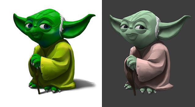
The image on the left used highly saturated colours, close to each other on the colour wheel while the right one has complementary colours, opposites on the colour wheel. I like the one on the right more but I like the mixture of the yellow and the green cloth on the left.

Friday, 19 February 2016

Week 20 - Putting the Art into Unity

Cristian roughly painted a few different scenes so that we could choose one we all agreed on and I had painted the potion so went and started assembling everything into Unity.

We decided on this background but with a slightly more purple hues. I hadn't been given any character to use yet so I placed one of the standard asset sprites so I could start sizing things and placing objects where I needed them.

Monday, 8 February 2016

Icons - Boosts

For our game we decided to do some boost items; a potion and some runes. All three of us feel more comfortable with character designing but as the tasks had to be split up we decided that Bryony will do the character sheets, Cristian will do the Backgrounds and I will do the icons and coding.

I like designing objects but as I am only really comfortable with sketches on paper, it was odd to render on Photoshop. We decided on a painterly looking style with pixel art characters so I didn't go into too much detail, though I did want to add beads and other bits however the icon will only be small so there's not really any point anyway.


I desaturated the icon to make a black and white version for when the object has not yet been picked up.

Sunday, 31 January 2016

Week 17 - Steampunk Design Assignment

I have always been a large fan of the steampunk genre despite how cliche it is so I was excited for this assignment.

I already knew I wanted to design a female character as I love the style and clothes. I looked up some typical accessories and fashions to give me something to go off, though I already have a lot in my mind as well as lots of my own steampunk style corsets and clothes to inspire me.

In a small sketchbook I drew a stereotypical character with a large dress, similar to the sketch on the left. I decided I wanted to try something a little different so designed another two in a more battle/rugged style.


I really like the design in the middle so bought it into Photoshop to colour it in. Using layers on the multiply setting, I added some base colours. I tried to minimize the saturation and variety of colours as steampunk designs usually use similar shades.


I built up slowly and added texture to the materials and skin. I'm still getting used to Photoshop so this all took a very long time.

Eventually I adjusted the eye as it looked wonky and changed up some inaccurate parts. I ran out of time at the end so some parts are very rough but overall I am happy with the design. I think I added the steampunk style without having to rely on cogs and gears and large dresses.

Saturday, 30 January 2016

Week 17 - Full Moon Prototype

In the early stages of the game we don't have that much art ready for us to use. I used what we have to begin  build the game as the gameplay should be worked on before the art so that it all fits together nicely.

I used the sketch of the character Bryony drew for both the main and enemy character and put in the background art Cristian drew. I really like how the background looks but we realised it was too short. We could shrink the screen size but instead I asked him to redraw it but more stretched. I also realised that it didn't look like the character is actually on the field. It is too obviously just an image and doesn't work well with the characters. I decided that 2048 * 1080 is a good resolution for the screen and showed Cristian how it needed to be edited to improve it.

Thursday, 28 January 2016

Week 17 - Hand Model

Last lesson we were taught how to make a hand.

I started with the fingers and tried to make them stocky and short like my dwarf design.

I decided on a slightly different design to my original. I intend to bring the glove and bracer into Zbrush and try some of the cloth brushes I have seen people use.
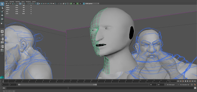
I'm not sure if the statue will be in the smoothed mode but this is how it looks. I feel the regular mode fits the style more but this looks more realistic.

I also went back to the head we had made for one of the lessons and worked on it and adjusted it to look like I wanted it to. I'm not sure how I will be making the beard yet but I think the rest of the features look okay.

Sunday, 24 January 2016

Week 16 - Life Drawing - Feet


 Again this week I struggled getting into drawing but after the few sketches began getting used to it.

 Thankfully for the next pose we were allowed to either use ink or any two medias of our choice. I'd used ink before and really enjoyed it so decided to go with that. I started with a more watered down ink and built up the shadows. I really like how the face came out most of all and feel I could have done better with a bit longer.

We then tried another pose, still with ink. I used thick ink around the body to make the shape stick out which I think is what was lacking in the previous drawing.

I found a flat, square-shaped brush to use which made some really nice marks though still made a thick enough stroke when I added enough water/ink.

I did better with the shades but to do that I had to use much more water meaning that once it dried, though the colours looked better, the paper was very creased, even more so when the previous drawing dried.


Lastly we looked at drawing feet. We didn't have long to draw them in so I focused on getting the shape right and not so much on the shading. I drew light circles where each of the knuckles were to help me get the shape of the toes.
 
I had a very good view of each foot in the next pose and although I had the same amount of time, I quickly got down the basic shapes as well as some crosshatching as the dirt.
There was one last pose to draw the feet but unfortunately I had forgotten my glasses and my eyes were straining too much so had to stop here.

Saturday, 23 January 2016

Week 16 - Rendering Curved Surfaces

In previous lessons we had looked and the correct way of rendering but only on flat surfaces, so this time we looked at curved surfaces.

We were given a sketch from 3D artist Jordu Schell to practice on as it a very round creature.

The painting lasted about 1-1.5 hours so we didn't go into too much detail but it was a good practice of what we were taught.

Wednesday, 20 January 2016

Full Moon - Original Concepts

For this term's game, the brief asks for a 2D, one screen (no screen scrolling) game. We were to get into groups of 4-5 though our group only has 3 so we will have to work a little harder.

We decided on a game based on a werewolf from a tribe as there are a few similar legends.

We made a quick paper prototype to present and help it come together in our minds. As we each have to make at least one art asset and one script, we also assigned jobs to each other. All three of us feel more comfortable doing character designs but unfortunately we had to compromise. We decided that Cristian will make the background concepts and design the summoned enemy, Bryony will design the rest of the characters and make their sprite sheets, and I will design the item boosts and do the scripting as out of all three of us, I feel more comfortable with Unity.

This is the quick background Cristian drew for our paper prototype. We wanted some bits to go with our theme but decided to not add any huts to later designs as we want the character to look more like an outcast.

Bryony sketched the designs for the main character. She added a mid-transformation design but to minimize the workload, we will just phase straight into day/night.
Although I am worried about our small group, I am actually looking forward to working in a group and creating a full game.